Gmail Responsive CSS Support in 2016: What Changed for Email Rendering
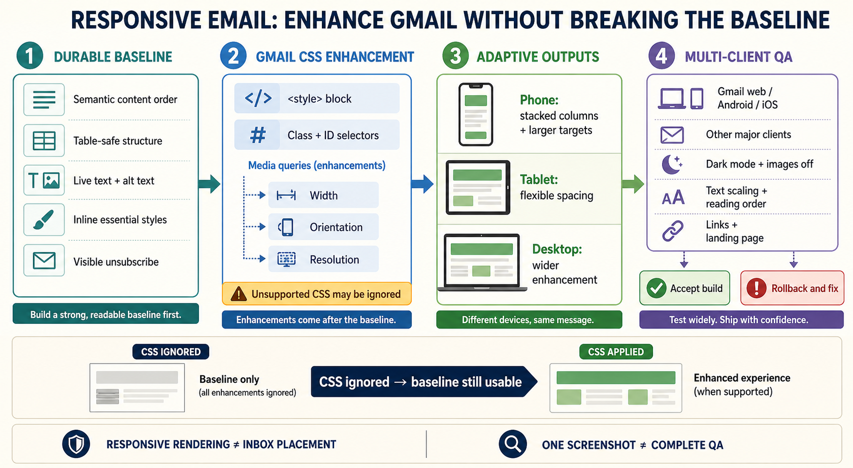
On September 21, 2016, Google published developer details for responsive email support in Gmail and Inbox by Gmail. The update allowed supported style blocks, class and ID selectors, and media queries based on width, orientation and resolution. It reduced the need to design every Gmail message as a fixed desktop layout, but it did not turn email into an unrestricted web page. Unsupported CSS could still be ignored, other clients retained different rendering engines, and a usable baseline remained essential.
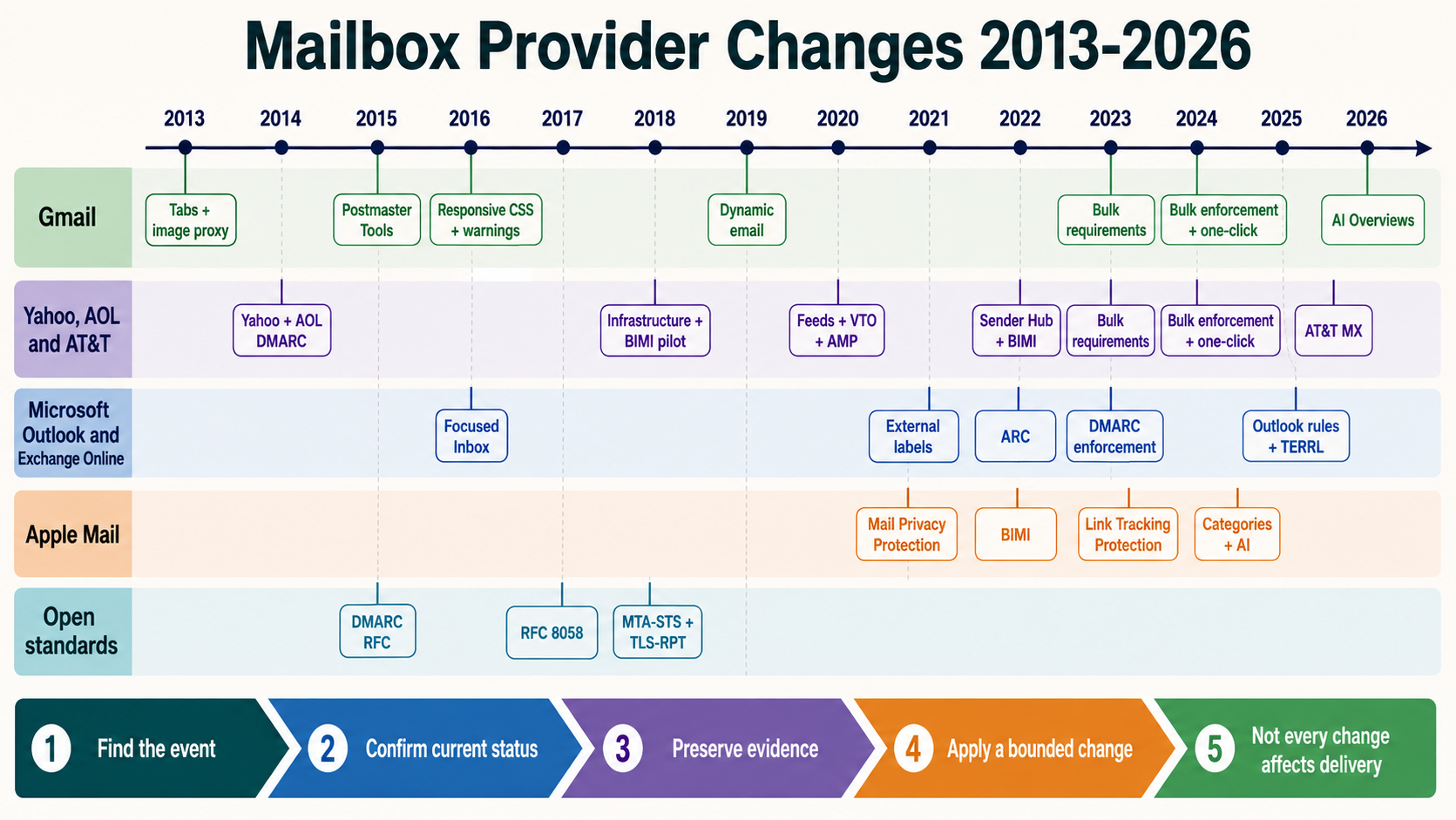
The dated mailbox-provider change
| Event field | Verified value | Why it matters |
|---|---|---|
| Historical event date | September 21, 2016 | This is the provider-change date, not the NitWings publication date. |
| Mailbox provider | Gmail | The affected provider estate determines which recipient cohorts require separate evidence. |
| Change area | Rendering | This identifies whether the change altered authentication, filtering, visibility, measurement or sender operations. |
| Current status | active-and-documented-with-client-specific-limits | Historical instructions are interpreted against the feature or standard that exists now. |
Mobile reading had become normal, yet many campaigns still used wide fixed tables, small text and buttons designed for a mouse. Gmail’s limited embedded-style and media-query behavior forced developers to rely heavily on inline CSS, fluid tables, hybrid layouts and client-specific workarounds.
Google announced the end-user benefit on September 14 and published the developer-focused update on September 21. The Workspace notice said rollout would begin after September 29 and proceed gradually. The event date in this series refers to the developer announcement, not a claim that every account changed that day.
The update supported media-query conditions useful for screen width, orientation and resolution. It also expanded selector and property support. This let one message adapt typography, spacing, stacking and tap targets across desktop, tablet and phone.
Email remained a constrained environment. Gmail sanitized markup, ignored unsupported constructs and was only one client family. Microsoft desktop clients, Apple clients, webmail systems and third-party accounts inside apps could render differently. Production quality still required a client matrix and graceful fallback.
How the system worked before the change
A fixed-width desktop message could overflow a narrow phone viewport. Recipients zoomed and panned, links were difficult to tap, two-column modules became cramped and long lines reduced readability. These were usability failures even when the campaign was delivered successfully.
Developers used inline styles because some Gmail surfaces removed or ignored embedded CSS. Responsive patterns relied on fluid percentages, max-width containers, table cells that could reflow without media queries and duplicated mobile or desktop content. These techniques increased code volume and maintenance risk.
Testing often produced misleading confidence. A template that worked in one Gmail web session could behave differently in a mobile app, an older account state or another mailbox client. Screenshot tests without interaction checks missed tap-target, zoom, reading-order and hidden-content problems.
Marketing teams sometimes treated rendering as a cosmetic concern. In practice, a hidden price, clipped confirmation code or unusable unsubscribe link affected conversion, support, complaints and compliance. Rendering belonged in delivery quality, not only visual design.
What changed on the provider side
Gmail began supporting responsive design using CSS in style blocks, selectors and media queries. Current documentation says Gmail supports class, element and ID selectors, many CSS properties, and media queries for screen width, device width, orientation and resolution. Unsupported properties or selectors may be ignored.
A designer could establish a robust baseline, then use a max-width query to stack columns, enlarge text, expand buttons or adjust spacing on smaller screens. A min-width query could enhance a desktop layout. Orientation or resolution queries could support specific image and layout decisions where the use case justified them.
The change did not authorize JavaScript, arbitrary external resources or every browser CSS feature. Email clients sanitize for security and reliability. Even supported CSS should not carry essential meaning that disappears when ignored.
The best architecture became progressive enhancement: semantic content and table structure first, safe inline baseline styles second, supported embedded CSS third, and media-query enhancements last. Plain text, accessibility, dark-mode behavior, images-off state and link destinations still required separate validation.
Message path before and after
Before
One fixed desktop-oriented HTML message
        |
        v
Limited embedded CSS and media-query behavior
        |
        +----> Wide table on phone
        +----> Small text and tap targets
        +----> Inline and hybrid workarounds
        |
        v
Recipient zooms, pans, abandons or mis-taps
After
Semantic message + safe inline baseline
        |
        v
Supported Gmail style block and selectors
        |
        v
Width / orientation / resolution media query
        |
        +----> Compact mobile adaptation
        +----> Tablet or landscape adaptation
        +----> Larger-screen enhancement
        |
        v
Multi-client rendering, interaction and accessibility QA
Who and what the change affected
| Traffic or stakeholder | What changed | Required interpretation |
|---|---|---|
| Email developers | Supported embedded CSS and media queries expanded. | Code to Gmail’s documented subset and preserve a usable baseline. |
| Mobile recipients | Text, buttons and layout could adapt to narrow screens. | Validate actual reading, tapping, zoom and content order. |
| Desktop recipients | Mobile-first messages could enhance for wider displays. | Avoid assumptions that desktop means unlimited width or one rendering engine. |
| Template systems | Reusable responsive modules became easier to maintain. | Control CSS size, selector collisions, inlining and build transformations. |
| Accessibility users | Responsive type and targets could improve usability. | Keep semantic order, contrast, alt text, focus and link purpose correct. |
| Deliverability teams | Rendering defects could affect engagement and complaints. | Treat HTML QA separately from SMTP acceptance and spam placement. |
Effect on delivery, placement and recipient visibility
Responsive CSS did not change SMTP acceptance or grant inbox placement. It changed the experience after a message was rendered. A campaign could authenticate, reach the inbox and still fail because the primary action was clipped or unreadable.
Better mobile usability could improve qualified clicks and reduce accidental interaction, but no universal uplift should be claimed. Audience, purpose, device mix, offer and destination experience determine the result. The change created capability, not a guaranteed metric.
Broken HTML could still trigger operational problems. Excessive size might lead to clipping, invalid nesting could produce inconsistent clients, hidden content could resemble deception, and an unusable unsubscribe path could increase spam complaints. Rendering quality therefore influenced downstream deliverability signals indirectly.
Image-only designs remained unsafe. Images could be blocked, inaccessible or cropped. Essential content, price, deadline, authentication code and unsubscribe information needed live text and meaningful alt behavior.
Current Gmail support is broader and documented, but cross-client constraints persist. A production message should remain usable when style blocks or a media query are ignored. The narrowest supported client often determines the structural baseline.
Effect on measurement and diagnosis
Rendering QA needs a declared client matrix. Record Gmail web, Android and iOS states relevant to the audience, plus major non-Gmail clients. Include screen widths, dark mode, images off, text scaling, forwarding and localization where material.
A screenshot is only one artifact. Test tap targets, link destinations, keyboard or assistive navigation where applicable, reading order, zoom, dynamic content, unsubscribe and plain-text equivalence. A visually attractive card can still have an incorrect destination or inaccessible order.
Compare outcome metrics by device and client only when identification is reliable and privacy-respecting. Open-derived client inference is distorted by proxies and privacy behavior. Click destination logs, controlled QA and user reports often provide better evidence.
Automated checks should validate HTML structure, duplicate IDs, required links, alt text, heading order, CSS size and forbidden constructs. They cannot replace real rendering because client sanitization and layout engines determine final behavior.
Experiments should isolate design decisions. Randomize a specific responsive component against a stable control, use clicks or task completion rather than opens alone, and watch complaints, unsubscribes and accessibility defects as guardrails.
Advantages for email marketers
| Potential advantage | When the advantage is real | Evidence to verify |
|---|---|---|
| Readable mobile layouts | Media queries are supported and baseline structure is sound. | Controlled renders plus task completion on narrow screens. |
| Larger touch targets | Buttons adapt without covering or hiding content. | Interaction QA and accidental-click monitoring. |
| Reusable modular templates | Selectors and components are governed in a build system. | Consistent snapshots, lint results and module ownership. |
| Fewer Gmail-only workarounds | Supported CSS replaces duplicated or brittle patterns. | Reduced code complexity without regression elsewhere. |
| Progressive enhancement | Essential content survives unsupported CSS. | Fallback renders with style blocks and images disabled. |
Disadvantages and operational risks
| Cost or risk | How it appears | Control |
|---|---|---|
| Web CSS assumptions enter email | A browser feature is ignored or stripped. | Use the current Gmail support reference and cross-client tests. |
| Media query becomes a dependency | Essential content works only at one breakpoint. | Build a usable baseline before enhancements. |
| One Gmail surface is treated as all clients | Another app or desktop engine breaks. | Maintain an audience-based client matrix. |
| Hidden duplicate content confuses users | Both mobile and desktop variants appear or screen readers repeat them. | Prefer reflow and semantic structure over duplication. |
| Testing optimizes screenshots only | Links, reading order or unsubscribe fail. | Add interaction, accessibility and destination validation. |
| Responsive email ends at a nonresponsive page | The email works but the landing task fails. | Test the complete email-to-destination journey. |
What email teams needed to do at the time
- Inventory existing Gmail workarounds. Identify inline, hybrid, duplicated and fixed-width patterns before refactoring.
- Build a baseline layout. Make reading order, essential text and actions usable without media queries.
- Add supported selectors and queries. Use width, orientation or resolution only when they solve a verified layout problem.
- Test gradual rollout. Keep old and new Gmail behavior in the matrix while support propagates.
- Retest other clients. A Gmail improvement must not break Outlook, Apple Mail or other important surfaces.
- Validate accessibility. Check live text, alt text, contrast, order and target size.
- Measure task outcomes. Use controlled clicks and completion rather than assuming responsive design always wins.
- Keep rollbackable templates. Version the build and preserve the last accepted render package.
What email teams should do now
- Consult current Gmail CSS documentation. Supported properties and queries can evolve; do not rely on a 2016 list.
- Use progressive enhancement. Semantic content and a safe inline baseline must survive unsupported CSS.
- Maintain table-based structural compatibility where needed. Modern CSS support does not remove every older-client constraint.
- Test Gmail web, Android and iOS. Include relevant account, theme, image and viewport states.
- Test non-Gmail clients. Prioritize the actual audience rather than a generic screenshot bundle.
- Automate preflight checks. Validate HTML, CSS, links, IDs, alt text, unsubscribe and content size.
- Run accessibility checks. Preserve logical order, readable text scaling, contrast and meaningful link labels.
- Test dark mode and images off. Avoid invisible logos, text baked into images and broken contrast.
- Validate the landing destination. Responsive email is incomplete if the next step fails on mobile.
- Keep rendering separate from placement. Diagnose SMTP, spam, category and HTML issues with different evidence.
Worked deliverability scenario
A retailer replaces a hybrid template with a media-query-driven two-column design. It looks correct in Gmail web and one Android test, so the team deploys globally. Support then reports that the checkout button is too small in another client and the unsubscribe link disappears when embedded CSS is stripped.
The team restores the last accepted build and reconstructs the template from a usable baseline. Essential text, button and unsubscribe remain visible with inline styles only. A supported max-width query stacks product columns and enlarges tap targets in Gmail, while the table structure remains compatible with constrained clients.
QA tests multiple Gmail surfaces, desktop Outlook, Apple clients, dark mode, images off, text scaling and localized long copy. Link automation confirms that displayed destinations match the approved campaign package.
A controlled experiment measures qualified product visits and completed checkouts, with complaints and unsubscribes as guardrails. The result is attributed to the tested layout, not to a claim that Gmail CSS support itself improves deliverability.
Evidence and diagnostics
- Source package: exact HTML, plain text, CSS, assets, build version and content hash.
- Client matrix: client, platform, version, viewport, theme, image state and text scaling.
- Sanitized output: received source, retained style blocks, rewritten selectors and ignored properties.
- Layout evidence: widths, stacking, overflow, clipping, typography and touch targets.
- Accessibility evidence: reading order, headings, alt text, contrast, zoom and link purpose.
- Interaction evidence: every URL, button hit area, unsubscribe, reply and destination behavior.
- Delivery evidence: SMTP and placement status kept separate from rendering findings.
- Outcome evidence: qualified clicks, task completion, complaints and support reports by reliable cohort.
Failure modes and incorrect conclusions
- Treating email like a normal web page. Client sanitization and unsupported CSS remain fundamental constraints.
- Putting essential content behind a media query. The baseline becomes incomplete when CSS is ignored.
- Testing only Gmail web. Gmail apps and non-Gmail clients can render differently.
- Duplicating mobile and desktop content blindly. Both variants can appear or be repeated by assistive technology.
- Using screenshots as the only QA. Interaction, source order and accessibility defects remain hidden.
- Equating better design with better inbox placement. Rendering occurs after transport and filtering decisions.
- Failing to version the build. An incident cannot be reproduced or rolled back safely.
Current status and superseding changes
Responsive CSS support remains active in Gmail. Current developer documentation lists supported class, element and ID selectors, a large property subset and media queries for screen or device width, orientation and resolution. It also warns that unsupported CSS may be ignored.
The supported surface has evolved since 2016, so current code should follow the live reference. Historical examples explain the milestone but are not a complete present-day compatibility table.
Cross-client fragmentation remains. Email developers still use conservative structure, inline baselines, progressive enhancement and client testing. Responsive support reduces some Gmail-specific constraints without eliminating the broader email-rendering problem.
The durable goal is not visual sameness. It is a message whose meaning, action, identity, unsubscribe path and accessibility survive each important client, with enhancements where the client supports them.
Operator checklist
- Record September 21, 2016 as the developer announcement date.
- Use September 24, 2016 as this series publication date.
- Keep essential content usable without embedded CSS or media queries.
- Use only currently documented Gmail selectors, properties and queries.
- Test Gmail web, Android and iOS across relevant states.
- Test important non-Gmail rendering engines.
- Validate links, unsubscribe and the mobile landing journey.
- Check semantic order, alt text, contrast and text scaling.
- Test images off, dark mode and long localized content.
- Version source and rendered evidence for rollback.
- Measure rendering outcomes separately from inbox placement.
Primary and contemporaneous references
- Google Workspace Updates: Emails optimized for every screen: Primary September 21 developer announcement and rollout detail.
- Google: Better emails tailored to all devices: Primary recipient-facing announcement.
- Google Developers: Gmail CSS Support: Current selectors, properties and media-query reference.